
TL;DR:
- Color psychology in renovations emphasizes selecting paint hues that influence mood and physiological responses within spaces. Matching color temperature and saturation to the room’s function creates emotional harmony, while ignoring undertones or lighting can lead to subconscious discomfort. In 2026, warm neutrals dominate design trends due to their versatility and psychological warmth across various lighting conditions.
Color psychology in renovations is the study of how paint and palette choices shape emotions, behaviors, and physiological responses within living spaces. A synthesis of 72 peer-reviewed studies confirms that color temperature and saturation produce consistent, measurable effects on mood and heart rate across populations. For homeowners and interior designers, this means every paint decision is also a decision about how a room will feel to live in. Getting it right requires more than picking a color you like. It requires understanding what that color does to the people inside the space.
How do different colors influence mood in interior spaces?
The psychological effects of paint colors fall into two broad categories: warm and cool. High-saturation warm colors like red and orange increase physiological arousal, raise heart rate, and stimulate appetite. This is why red has historically dominated restaurant interiors. It is not accidental design. It is applied color theory.
Cool colors work in the opposite direction. Blues and muted greens reduce stress and lower heart rate, which is why they appear so frequently in healthcare environments and bedrooms. An experimental study with 100 participants found that warm saturated hues stimulate arousal while cool desaturated colors aid emotional regulation. That finding has direct implications for room-by-room color choices in any renovation.
The effects break down into three practical categories:
- Warm, high-saturation colors (red, orange, deep yellow): increase energy, stimulate conversation, and raise metabolic activity. Best suited for dining rooms and social spaces.
- Cool, desaturated colors (soft blue, sage green, lavender): calm the nervous system and support focus. Preferred by creative professionals for studios and home offices.
- Warm organic neutrals (putty, greige, terracotta-toned whites): create comfort and visual sophistication without the physiological intensity of saturated hues. These are the workhorses of modern residential design.
Paint is not mere decoration. Color expert Michelle Lewis describes it as a neurological activation tool that can either enhance or drain cognitive potential depending on how it is used. That framing should change how you approach every renovation color decision.
Why color congruency matters more than color preference
Color-emotion associations are context-dependent. A color that feels sophisticated in one room can feel oppressive in another. This is the core principle of color congruency: the emotional tone of a color must match the intended function of the space. When it does not, occupants experience subconscious friction. They cannot always name the problem, but they feel uncomfortable.
Consider the most common mismatch: stimulating red in a bedroom. Red increases arousal and heart rate, which is the opposite of what a sleep environment requires. Conversely, a cool gray-blue in a home gym can feel sterile and demotivating rather than energizing. The color itself is not wrong. The placement is.
“Color psychology effects are amplified when color matches the emotional tone of the room, creating congruency and cognitive fluency.” — The 12 emotional journeys of color psychology
The color-in-context principle also explains why the same blue reads as serene in a spa bathroom and cold in a north-facing kitchen with limited natural light. Room function, cultural associations, and lighting all shape the final emotional response. Designers who ignore this produce spaces that look good in photos but feel wrong to live in.
Pro Tip: Before selecting any color, write down the primary emotional goal for the room. Calm? Energized? Focused? Intimate? Then choose a color category that physiologically supports that goal, not one that simply appeals to your taste.
What are the 2026 color trends shaping renovation palettes?
Interior design trends in 2026 mark a clear departure from the cool gray era that dominated the previous decade. The shift is toward warm organic neutrals like warm putty, greige, and terracotta-toned whites. These tones offer the versatility of a neutral while carrying the psychological warmth that cool grays simply cannot deliver.
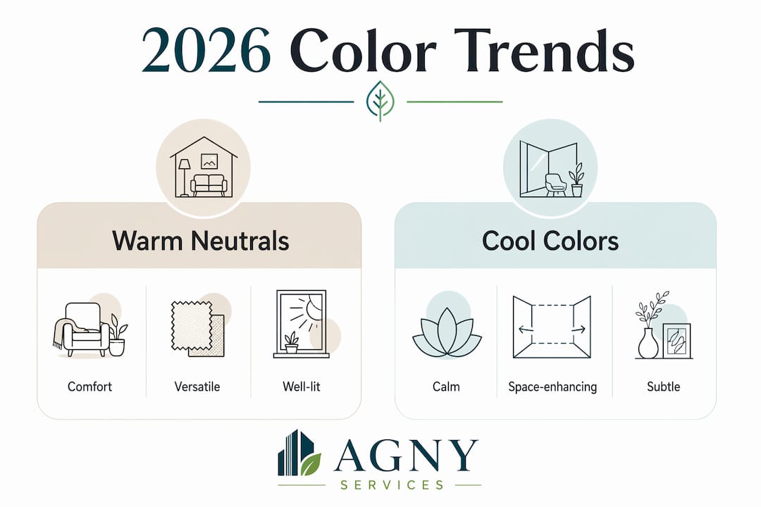
This trend is not purely aesthetic. Warm neutrals perform better across different lighting conditions, which matters in open floor plans where a single wall color must read well under morning sun, afternoon shadow, and evening artificial light. They also pair more naturally with wood tones, stone countertops, and the organic materials that define high-end residential design right now.
| Color category | Psychological effect | Best room application |
|---|---|---|
| Warm putty / greige | Comfort, sophistication, calm | Living rooms, open floor plans |
| Terracotta-toned white | Warmth without intensity, grounding | Kitchens, dining areas |
| Soft blue / sage green | Stress reduction, nervous system regulation | Bedrooms, bathrooms, home offices |
| Deep warm red / burnt orange | Arousal, appetite stimulation, energy | Dining rooms, accent walls |
Agny’s work on NYC luxury renovation trends reflects exactly this shift. Clients are moving away from stark white and cool gray toward palettes that feel considered and livable. The psychological comfort of warm neutrals is a significant driver of that preference.
How to select paint colors using color psychology principles
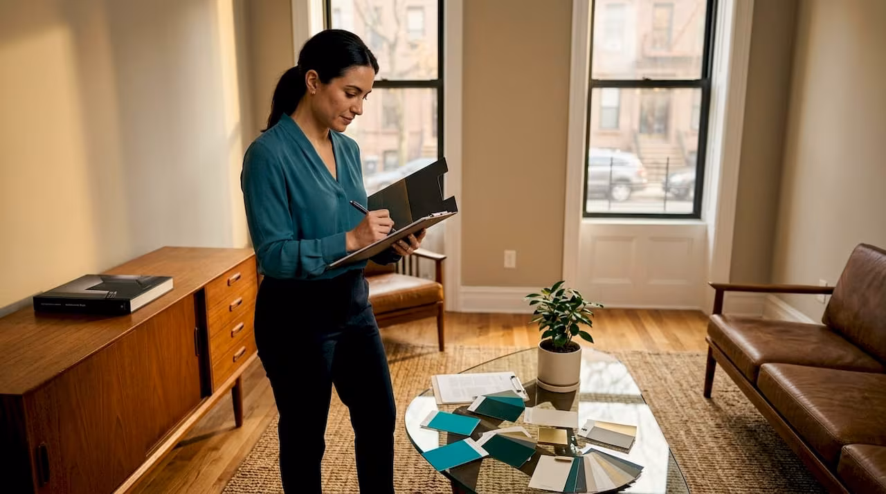
Choosing the right color for a renovation requires a structured process, not a gut reaction in a paint store aisle. The most common mistake is selecting a color in isolation, without accounting for the room’s fixed elements.
Start with what you cannot change:
- Identify your fixed finishes. Flooring, countertops, cabinetry, and tile all carry undertones. A warm-toned wood floor will clash with a cool gray wall in ways that no amount of lighting adjustment can fix. Your paint color must work with these elements, not against them.
- Test samples against white paper. Isolating paint samples on white paper removes the influence of surrounding colors and lets you see the true undertone. This is the single most underused technique in residential color selection.
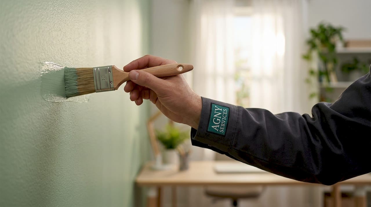
- Use peel-and-stick samples on the actual wall. Paint a large swatch, at least 12 by 12 inches, and observe it at multiple times of day. Morning light, midday sun, and evening lamp light can make the same color look like three different shades.
- Assess the room’s lighting type. North-facing rooms receive cool, indirect light. South-facing rooms get warm, direct sun. A color that reads beautifully in a south-facing showroom can feel cold and flat in a north-facing bedroom.
- Separate personal preference from home needs. This is where most homeowners struggle. Prioritizing the home’s context over personal taste reduces decision anxiety and produces better results. If your home needs a warm neutral and you prefer cool blues, find a blue with warm undertones rather than forcing a mismatch.
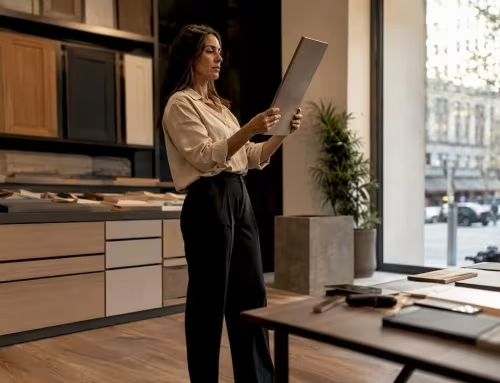
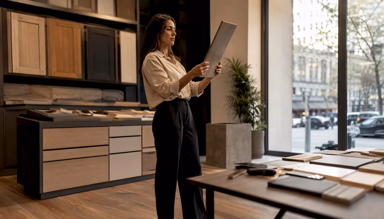
Pro Tip: If you are renovating a bathroom or kitchen, consider how the color will interact with the materials you are installing. Agny’s team regularly helps clients align color choices with property value by treating paint selection as part of the overall material strategy, not an afterthought.
The process also applies to managing conflicting preferences between household members. When two people disagree on color, the most productive approach is to return to the room’s function and agree on the emotional goal first. Color category decisions are easier to reach consensus on than specific shades.
Common pitfalls and expert strategies for color psychology in home design
The biggest mistake in applying color theory to home decor is treating color meanings as fixed rules. Poorly lit spaces can make cool colors feel sad and sterile rather than calm. Scale matters too. A deep navy that looks dramatic on a small sample card can feel suffocating on four walls of a small room.
Here are the most common errors and how to avoid them:
- Ignoring undertone consistency. Homeowners often underestimate how undertones affect cohesion. A warm greige wall next to a cool gray trim creates visual tension that reads as a mistake, even if neither color is wrong on its own.
- Over-relying on blanket color meanings. “Blue means calm” is a starting point, not a rule. The specific shade, saturation, and lighting environment determine the actual emotional response.
- Skipping the 3-5-7 rule for neutrals. The 3-5-7 rule applies three tones in different proportions to create visual hierarchy and prevent flat, uninviting spaces. Use your dominant neutral at 70%, a secondary tone at 20%, and an accent at 10%.
- Neglecting texture layering. Layering materials with different light absorption properties, such as matte walls with glossy tile and natural linen, enriches neutral palettes and adds depth that paint alone cannot achieve.
Pro Tip: When working with a neutral palette, choose all your materials before finalizing paint. The paint color should resolve the undertone tension between your fixed finishes, not introduce a new one.
Color expert Kylie M recommends removing personal bias entirely during the selection process and treating the home as a client with its own needs. That professional detachment produces better outcomes than emotional attachment to a color you saw in a magazine.
Key takeaways
Color psychology in renovations works because specific hues produce measurable physiological and emotional responses, and matching those responses to room function is what separates a space that looks good from one that genuinely feels good.
| Point | Details |
|---|---|
| Warm vs. cool color effects | Warm saturated colors raise arousal; cool desaturated colors reduce stress and lower heart rate. |
| Color congruency is critical | Mismatching color to room function creates subconscious discomfort, regardless of how good the color looks in isolation. |
| 2026 trends favor warm neutrals | Warm putty, greige, and terracotta-toned whites outperform cool grays across lighting conditions and material pairings. |
| Test before committing | Use peel-and-stick samples observed at multiple times of day to see how a color actually performs in your specific space. |
| Undertone consistency matters | All colors in a room, including trim and fixed finishes, must share compatible undertones to create a cohesive result. |
What I have learned from watching color transform spaces
After years of working on renovations across kitchens, bathrooms, and living spaces, I have come to one firm conclusion: homeowners consistently underestimate what paint does to a room. They budget generously for tile and cabinetry, then treat paint as the last decision. That order should be reversed.
The research is clear, but the lived experience is what convinces me. I have watched clients move into a newly renovated kitchen painted in a warm putty tone and immediately describe it as “cozy” or “expensive-feeling” without being able to say why. The cabinetry did not change. The layout did not change. The color shifted the entire emotional register of the space.
What I find most useful is the combination of scientific grounding and contextual judgment. Knowing that cool blues reduce heart rate is valuable. Knowing that a specific blue reads as cold in a north-facing bathroom with no window is the practical knowledge that actually protects a client’s investment. The two have to work together.
My advice to any homeowner starting a renovation: treat color selection as a design decision with the same weight as material selection. Bring your designer into the conversation early, test samples in real conditions, and let the room’s function guide the emotional goal. The color follows from that.
— Grzegorz
How Agny approaches color in every renovation project
At Agny, color psychology is part of the design conversation from the first client meeting, not a detail added at the end. Whether the project is a kitchen renovation or a bathroom remodel, the team considers how the chosen palette will interact with lighting, fixed finishes, and the emotional goals of the space. Agny brings together renovation expertise and design knowledge to help homeowners make color choices that hold up over time, both aesthetically and psychologically. If you are planning a renovation in New York City and want a team that treats color as a structural decision, contact Agny to start the conversation.
FAQ
What is color psychology in renovations?
Color psychology in renovations is the practice of selecting paint colors and palettes based on their documented effects on mood, behavior, and physiological responses. It applies research from environmental psychology to make spaces feel intentional and emotionally appropriate.
Which colors promote relaxation in a bedroom?
Cool, desaturated colors like soft blue, sage green, and lavender are the most effective for promoting relaxation. A synthesis of 72 peer-reviewed studies confirms these tones reduce stress and lower heart rate, making them well-suited for sleep environments.
How does lighting affect paint color choices?
Lighting changes how a color reads on a wall. North-facing rooms with cool indirect light can make cool grays and blues feel cold or sterile, while south-facing rooms with warm direct sun can intensify warm tones. Always test paint samples in the actual room at multiple times of day before committing.
What are the best neutral colors for open floor plans in 2026?
Warm putty, greige, and terracotta-toned whites are the leading choices for open floor plans in 2026. These tones perform well across varied lighting conditions and pair naturally with wood, stone, and organic materials that define current high-end residential design.
How do I avoid color mistakes in a renovation?
Focus on undertone consistency across all surfaces, test samples in real conditions rather than relying on store swatches, and match the color’s emotional tone to the room’s function. Separating personal preference from the home’s actual needs is the most effective way to reduce decision errors.


