
You've chosen the tile, approved the layout, and brought home a few grout cards. In the showroom, the white subway tile looked clean and almost continuous. In a Manhattan bathroom with cool LED bulbs, the same tile paired with a sharp gray grout can suddenly look like a high-contrast grid.
That surprise is common because grout isn't a finishing detail you can judge in isolation. It changes how large the tile appears, how strongly the pattern reads, how easily soil shows, and whether the finished room feels calm or busy. The reliable way to choose is to evaluate visual effect, maintenance, and actual room lighting together, then test the combination before ordering.
Why Grout Color Changes Everything About Your Tile
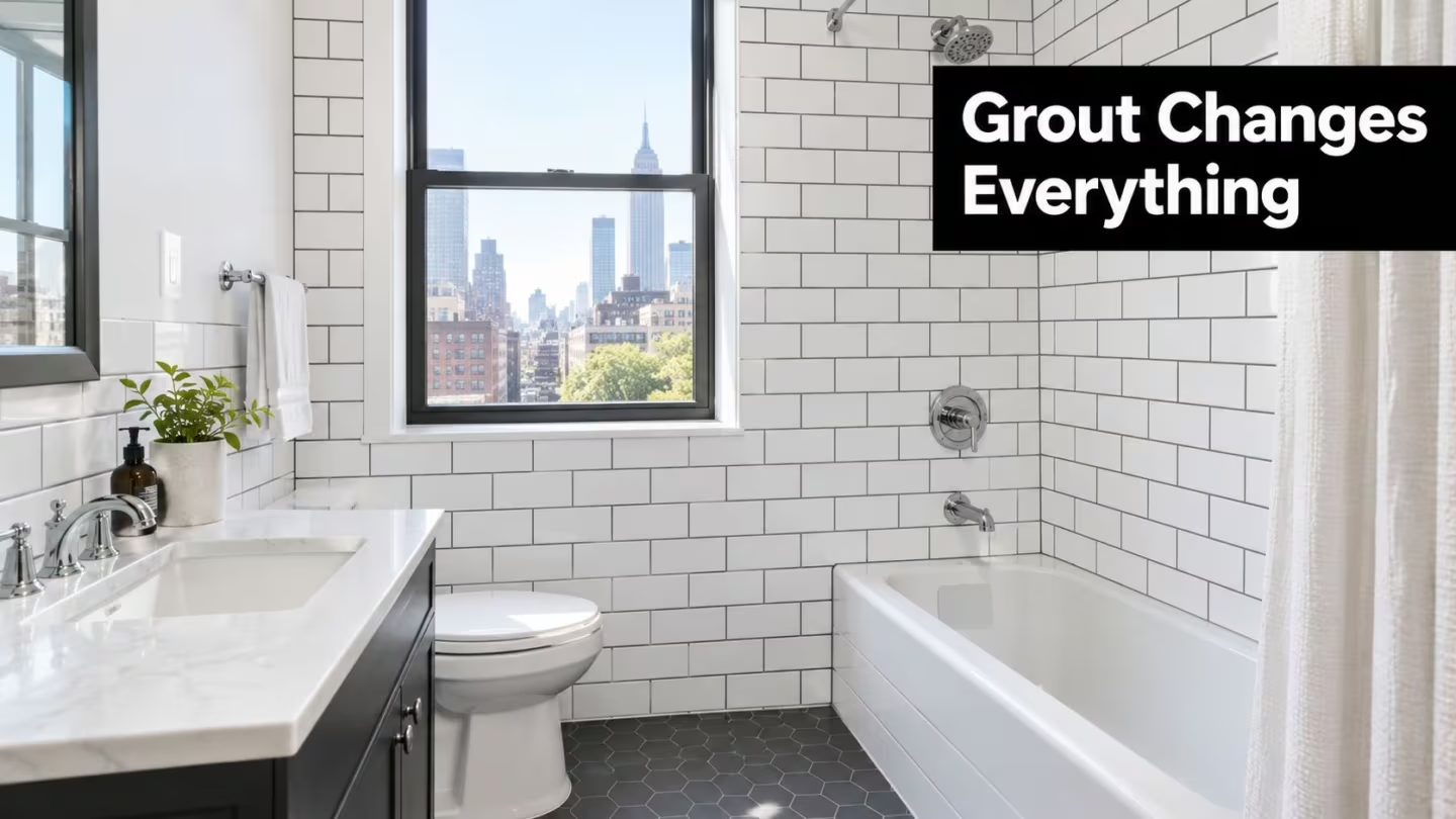
A white subway tile with dark grout makes every joint visible. The tile shape becomes part of the architecture, and the wall can feel more graphic and deliberate. The same tile with a soft gray or warm greige grout blends the field together, which is often more comfortable in a compact NYC kitchen or bathroom where cabinets, plumbing fixtures, mirrors, and lighting already compete for attention.
I've seen homeowners approve a grout from a small showroom chip, then dislike the installed result because the joint color was doing more visual work than expected. A contrasting grout can make slightly inconsistent tile edges more noticeable. A close match can soften those irregularities and let the tile's glaze, texture, or veining carry the design.
The three questions that prevent expensive mistakes
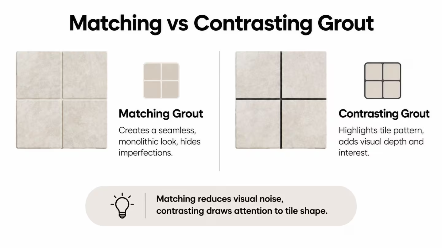
What should the surface look like? Matching grout creates continuity. Contrasting grout highlights the joint layout and tile geometry.
How much cleaning can the room tolerate? Light grout reveals dirt and spills quickly, while dark grout can make soap residue, efflorescence, and pale deposits more noticeable. Mid-tone neutrals often provide the most forgiving compromise.
What will the light do to the color? Daylight, warm lamps, and cool LEDs can shift the appearance of the same grout. That matters in apartments with limited natural light, especially when a gray shade can read blue or a beige shade can look muddy.
Neutrals remain the dominant grout choice, particularly earth tones and blue-gray families, while manufacturers have broadened their palettes for homeowners who want grout to act as a design element. One manufacturer's lineup expanded to 40 grout colors, including nine nature-inspired additions in 2015, a sign that grout has moved beyond a purely functional decision. Industry trend coverage on grout technology and style reflects that broader choice.
For a second professional perspective before you commit, this practical grout selection advice is useful because it treats color as part of the complete tile installation rather than a last-minute accessory.
Reading Your Tile and Joint Width Before Picking a Color
Start with the tile already selected. Don't choose grout by color family alone, because the tile's finish, undertone, size, and edge all change how the joint will be seen.
A large-format matte porcelain usually benefits from a grout that supports a quiet, slab-like appearance. If the grout contrasts strongly, the installation can develop a pronounced network of lines that works against the broad visual scale of the tile. A glossy subway tile behaves differently. Its reflective surface can make the joint look sharper, particularly under directional vanity lighting.
Natural stone needs closer attention to undertone. Cream, beige, taupe, and gray can all appear neutral on a card, yet one may fight the stone's warmer veining. Textured porcelain and wood-look tile also tend to disguise small variations when the grout sits within the tile's existing tonal range.
Joint width controls the volume
A narrow joint keeps grout visually quiet. A wider joint gives the color more presence, so a shade that looks subtle on a sample can become a defining feature across a backsplash or floor. The joint also affects the sense of scale. A strong contrast can emphasize every rectangle, plank, hexagon, or herringbone angle.
Before comparing colors, write down these details:
- Tile surface: Note whether it's glossy, matte, polished, textured, veined, or color-body porcelain.
- Tile undertone: Decide whether the dominant cast is warm, cool, creamy, blue-gray, or earthy.
- Tile format: Small repeating pieces create more joints, while large pieces create fewer visual interruptions.
- Joint width: Confirm the installer's planned width rather than guessing from a display board.
- Room exposure: Record daylight, artificial lighting, traffic, and whether the area receives water, cooking residue, or outdoor dirt.
Field check: Stand several feet away from the tile and squint slightly. If the tile pattern disappears, a close grout match will probably support the intended look. If the pattern remains important, a measured contrast may be appropriate.
The grout product must also suit the joint and tile. Industry guidance distinguishes products by installation requirements, and commercial grout lines commonly offer roughly 40 to 60 standard colors, depending on the product line. This grout color chart and specification guidance shows why the manufacturer, range, and color code need to be recorded rather than described loosely as “medium gray.”
For a renovation where tile scale and room proportions are being coordinated together, review this kitchen renovation reference for Manhattan and Brooklyn alongside your tile sample, not after the materials have been ordered.
Matching vs Contrasting Grout and When to Use Each
Matching grout is the safer visual strategy when the tile itself has enough character. It creates a continuous surface, minimizes visual noise, and helps a small room feel less segmented. In a narrow NYC bathroom, a white tile with a soft white or pale warm-gray grout can keep the wall visually quiet, allowing the mirror, stone vanity, or lighting fixture to provide the accent.
Contrasting grout is more intentional. It outlines each tile and gives the layout a stronger rhythm. White subway tile with charcoal grout feels architectural and graphic, while white tile with light gray grout provides definition without the hard outline of charcoal. Herringbone, hexagonal, and encaustic patterns often benefit from contrast because the layout is part of the design rather than a background surface.
Wood-look tile usually works better with a coordinated greige, taupe, or brown-gray grout than with a stark white. The goal is to support the plank effect and avoid drawing a ladder of lines across a floor. A pale grout may look attractive in a sample but can become visually disconnected from the wood tone once the full installation is viewed.
Matching and contrasting at a glance
| Approach | Visual Effect | Best For | Watch Out For |
|---|---|---|---|
| Matching grout | Creates a calm, continuous field | Large-format tile, compact rooms, textured surfaces | Can make a layout feel flat if the pattern is the main design feature |
| Soft contrast | Defines tile edges without dominating | Subway tile, marble-inspired tile, balanced kitchens | The undertone must agree with the tile |
| Strong contrast | Makes geometry and joint lines prominent | Herringbone, graphic layouts, feature walls | Highlights uneven edges and creates a busier room |
| Coordinated grout | Connects tile to surrounding finishes | Wood-look tile, stone, warm cabinetry | A near-match can look accidental if it misses the undertone |
For resale, moderate contrast is usually easier to live with than an extreme black-and-white statement. It still gives the tile definition, but it doesn't force the next owner to accept a highly graphic pattern in a room they may want to simplify. Homeowners planning a compact bath can also find useful layout ideas in this guide to renovating a small bathroom with Western Bathroom.
Keep the full room in view. This bathroom renovation reference for Manhattan and Brooklyn is the kind of context that matters, because grout should relate to the tile, vanity, floor, wall paint, and available light together.
Maintenance Staining and Grout Type That Affect Color Longevity
A grout color that looks perfect on installation day can become a daily cleaning problem if it doesn't fit the room. White grout shows soil, cooking splashes, and tracked-in dirt readily. Very dark grout hides some stains and footprints, but it can reveal light residue, soap film, and mineral deposits more clearly.
That's why mid-tone greige, taupe, mocha, and light gray are practical choices for many kitchens, entries, and showers. They reduce the contrast of ordinary wear without turning the room into a dark grid. The right shade still depends on tile texture, traffic, water exposure, and lighting, so a “low-maintenance color” isn't universal.
The room determines the burden
A kitchen backsplash deals with grease and food splashes. A shower deals with moisture, soap, and minerals. An entry floor deals with grit and footprints. Each room makes discoloration visible in a different way, and textured tile can hold residue in places that a smooth tile won't.
Colored grout needs the same basic cleaning and sealing attention as standard grout. A maintenance-focused guide recommends daily sweeping, weekly pH-neutral mopping, monthly inspection and scrubbing, and resealing every 6 to 12 months in wet areas. This grout maintenance guidance also warns that regular bleach-based cleaning can fade colored pigments in as little as 3 to 6 months, while hydrogen peroxide above 6 percent can bleach pigments.
Maintenance rule: Pick a color that can stay presentable with neutral cleaners. Don't choose a dark or saturated grout and then plan to maintain it with aggressive bleach.
Grout type matters as well. Cementitious grout generally depends on proper curing, cleaning, and sealing practices. Epoxy grout is a different material choice and can offer stronger resistance to staining, but the installer still needs to confirm compatibility with the tile, joint, finish, and project conditions.
Use a sealer appropriate to the product rather than treating every grout as interchangeable. Ask for the manufacturer's cleaning instructions in writing, document the product name and color code, and keep a spare record for future repairs. A close replacement is much easier to locate when the original specification is clear.
Testing Grout Colors In Your Actual Light and Locking the Choice
Never approve grout from an isolated color chip. The chip doesn't show the tile's reflective surface, joint pattern, color casting, or the way grout changes as it dries.
Build a three-swatch mockup instead. Use a full tile sample for each option and apply the candidate grout in the same approximate joint width planned for the installation. Keep the samples large enough to view from normal standing distance, because close-up inspection exaggerates small color differences.
A practical in-room test
- Use three meaningful options. Start with a close match, a softer contrast, and a stronger contrast. For warm tile, that might mean warm white, light greige, and taupe. For cool white tile, it might mean white, cool gray, and charcoal.
- Place the mockup where the tile will go. Put a bathroom sample beside the vanity, shower wall, or floor area. Put a backsplash sample near the counter and cabinets.
- Check it at two times of day. Compare daylight and the room's evening lighting. Cool LEDs can push some grays toward blue, while low natural light can make warm neutrals look heavier.
- View it from standing distance. Look at the entire tile-plus-grout relationship, not just the joint. Check it from the doorway and from the normal working position.
- Wait for full cure. Grout often looks darker while wet and changes as it cures. Don't approve the final shade from a freshly installed patch.
Tiling guidance on selecting grout color specifically recommends testing a full tile sample in the room's real lighting at different times of day and assessing it from normal standing distance. That process is more reliable than comparing tiny cards under showroom lights.
Put the decision in the tile schedule
Once the sample works, record the manufacturer, product range, color name, and color code in the tile schedule. Include the tile name, finish, size, joint width, installation location, and grout type. “Light gray grout” isn't enough for a multi-room renovation, especially if the project includes different products or future repairs.
Ask the installer to confirm the selected product before mixing. A mockup can reveal the appearance, but the specification protects the purchase and installation from substitutions.
Finishing Tips Common Pitfalls and NYC Style Considerations
The strongest grout decision is usually the one that survives ordinary life without demanding constant correction. Seal the grout when the product requires it, use pH-neutral cleaners, and follow the manufacturer's instructions instead of reaching for bleach whenever the surface looks dull.
Avoid these common errors:
- Choosing from a tiny chip: A small card can't show how the shade interacts with tile texture and joint width.
- Ignoring undertone: A cool gray beside warm stone can look disconnected, even when both colors seem neutral separately.
- Skipping the cure period: Wet grout can appear darker than the finished color.
- Overlooking room exposure: A shower, entry floor, and backsplash don't collect the same soil.
- Using extreme contrast without a reason: Black against white may be striking, but it makes every joint and tile edge part of the statement.
- Assuming dark means maintenance-free: Dark grout can conceal some dirt while making pale residue and soap film more obvious.
Warm, flexible neutrals such as greige, taupe, beige, mocha, and light gray are often a sensible middle ground for NYC resale. They work with changing cabinet colors and hardware, avoid the starkness of a pure black-and-white scheme, and generally make everyday soil less visually aggressive than white or very dark options. That doesn't mean every project should be neutral. A dramatic grout can be the right choice when the tile pattern is meant to command attention.
Keep your final materials record with the renovation documents. Include the grout product, color code, sealer, cleaning instructions, and the approved mockup photo. For coordinated tile, waterproofing, plumbing, and finish work, the relevant project documentation can sit alongside this Manhattan and Brooklyn contractor reference.
AGNY Services LLC coordinates tile installation and related kitchen and bathroom renovation work across NYC and New Jersey, including design coordination and finish specifications such as grout selection. Visit AGNY Services LLC to request a paid estimate or consultation, and bring your tile sample, lighting details, and preferred maintenance level so the grout choice can be reviewed before ordering.